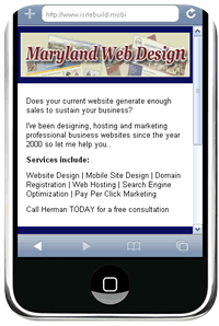
- Have you checked your stats to see how many visitors are accessing your site with a mobile phone?
- Is your current site mobile-friendly?
- Should you have a dedicated mobile site or utilize responsive web design?
When I search for a local business using my iPhone and the business website is not mobile friendly I leave right away because it takes too much time to view the information. For instance I have to constantly pinch, squeeze and scroll the screen to make the text large enough to read. Often I’m waiting for large images to upload as they slowly appear on the screen.
According to a Google study…
- Nearly 75% of users prefer a mobile-friendly site
- 96% of consumers say they’ve encountered sites that were clearly not designed for mobile devices.
- 61% of users said that if they didn’t find what they were looking for right away on a mobile site, they’d quickly move on to another site.
- 79% of people who don’t like what they find on one site will go back and search for another site.
- 50% of people said that even if they like a business, they will use them less often if the website isn’t mobile-friendly.
Responsive Web Design or Dedicated Mobile Website…which is better?
What is Responsive Web Design?
This refers to a website that adapts to the viewing environment whether it is a desktop computer, tablet or mobile phone
Benefits of Responsive Web Design
- No need to develop a separate website for mobile users.
- Google recommends responsive web design so they don’t have to crawl separate sites.
- It takes less work because you only have to build one site.
What is a Dedicated Mobile Website?
This refers to building a separate site dedicated to mobile users. It can either reside on it’s own domain (.mobi) or be installed in a sub directory of the main site (ie domain.com/m/). When visitors access the main site they automatically get redirected to the mobile site.
Benefits of a Dedicated Mobile Website
Speed
Mobile users want to access information as fast as possible from anywhere at anytime. A dedicated mobile site contains less code and smaller images than responsive design sites.
Only serve relevant content
Responsive design sites display all the same information you would normally see on a desktop computer even if it’s irrelevant for the mobile user. For instance when making an appointment for your local dentist you only need the name, number and perhaps a map how to get there.
Example Case Study
Recently I created a new mobile design for a Real Estate Company in Baltimore Maryland. I chose not to utilize responsive web design because the owner said many customers use mobile phones to contact his business therefore a dedicated mobile site would provide a fast, user friendly way for customers to contact him.
Mobile-friendly Design
I decided to build a one page (screen) mobile website that included a:
- Header graphic: This includes a captivating image with a prominent logo so mobile users would know immediately what company they are contacting.
- Title: This explains exactly what the business is about.
- Introductory paragraph: This primarily outlines the benefits of doing business with this company.
- Touch to call: This displays a small phone graphic with the business telephone number.
I also built an html version of the site for customers searching for his business using their computers.
My recommendation
Take a look at your website statistics. Are many customers accessing your website from mobile devices? If so, are they quickly and easily able to find the most relevant information with your current design?
If your mobile customers don’t need to view all the information available from a responsive designed site consider creating a dedicated mobile site that only contains the absolute information they need.
Get a Mobile Website For Your Business
Contact Maryland Web Design to discuss your company’s goals, objectives and the specific needs of your target audience.
Related Articles
Top 7 Reasons to Create a Mobile-Friendly Website
Mobile Website Design – Before and After Case Study
Create Your Own Mobile Website In Minutes With a Free Online Builder
7 Ways To Create A Mobile Version Of Your Website

