Recently one of my clients asked me to view his website on a mobile smart phone. Since my wife purchased an iPhone4S for me last Christmas I decided to check it out. Unfortunately I could only view it by pinching, squeezing and scrolling…in other words it took some work. If I was a customer I probably wouldn’t bother and find a more mobile friendly site design.
Let me ask you a question…does your current desktop website display correctly on a smart phone? If not seriously consider getting mobile version of your current site designed so it appeals to a wider audience particularly for those on the move.
Let’s look at the before and after images of my client’s website when viewed on an iPhone or using http://iphonetester.com/


Before
As you can see the desktop website doesn’t correctly display on a mobile phone. You have to scroll horizontally and vertically to view the whole web page.
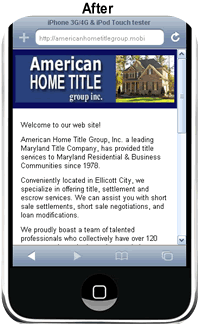
After
After designing a mobile version of the desktop website it now displays correctly on all mobile phones. Visitors can now quickly and easily view the web pages on one screen and even click or touch their mobile screen to call the business phone number.
Video: Mobile Web Design Case Study
And now I’d like to invite you to get a mobile website designed for your business to attract and retain more of your customers.
Visit: Mobile Website Design Maryland
Related articles
Top 7 Reasons to Create a Mobile-Friendly Website
Mobile Website Design: 5 Must-Have Features
Top 7 Mobile Web Design Principles to Consider

i have seen the website, good jod.
Everyone loves it whenever people come together and share thoughts.
Great site, keep it up!